In this tutorial we would learning how to implement Hierarchical Clustering in Python along with learning how to form business insights..
To learn more about Hierarchical Clustering in detail you can refer to this tutorial: Hierarchical Clustering Explained
For this tutorial we will make use of the following dataset. Click below to download the following:
Firstly let us load pandas in our environment
import pandas as pdLet us read our CSV file
X = pd.read_csv("Kmeans_data.csv")Now we are viewing initial rows of our dataset. It is a retail dataset where each row represents different customer. We have the following columns:
CustomerID: Unique identifier for each customer
Amount: Total monetary value of the transactions till today by a customer
Frequency: How many times a customer has come to our store
Amount: How many days ago the customer came to our store
X.head()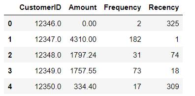
Let us look at the shape of our dataset. We have 4293 rows and 4 columns
X.shapeOutput: (4293, 4)
Let us load all the other libraries for this lesson:
import scipy.cluster.hierarchy as sch
from sklearn.preprocessing import StandardScaler
from sklearn.cluster import AgglomerativeClustering
The variables in our data has different scales (eg., amount is in 100s to 1000s, while recency and frequency column have values less than 1000). thus it might adversely impact the calculation of Euclidean distance calculated while running Hierarchical clustering. Due to this we need to standardise our data to have the same scale.
Initialising the standard scaler:
scaler = StandardScaler()Fitting and storing our scaled data in X_scaled.
X_scaled = scaler.fit_transform(X)Our scaled array looks as follows:
X_scaledOutput:
array([[-1.71465075, -0.72373821, -0.75288754,  2.30161144],
       [-1.71407028,  1.73161722,  1.04246665, -0.90646561],
       [-1.71348981,  0.30012791, -0.46363604, -0.18365813],
       ...,
       [ 1.73043864, -0.67769602, -0.70301659,  0.86589794],
       [ 1.73101911, -0.6231313 , -0.64317145, -0.84705678],
       [ 1.73392146,  0.32293822, -0.07464263, -0.50050524]])
Creating the dendogram
With the following code we can draw a dendogram for our standardised data, using 'ward' method for grouping the observations into a cluster.
linkage function results in a distance matrix for our data. dendogram function uses this distance matrix to create our dendogram.
From the below image we can see that Hierarchical clustering suggests 2 major clusters.
sch.dendrogram(sch.linkage(X_scaled, method = 'ward'))

import matplotlib.pyplot as plt
plt.title('Dendrogram')
plt.xlabel('Customers')
plt.ylabel('Euclidean distance')
plt.show()
How we have interpreted this dendogram?
The difference in Euclidean distance (x-axis) before we split the observations in 3 clusters (i.e., 100-78 = 22) is the maximum , while if we look at the difference in Euclidean distance for moving from 3 to 4 clusters (i.e., 78-58 = 20) is lower.
We want this difference in Euclidean distance to be maximum before another cluster is formed.
Note: You can also experiment with different linkage criteria. Eg. single, complete, average etc., While conducting this analysis on this data, when I had tried different linkage criteria, the results were not that satisfactory, thus 'ward' method led to best clusters on this data.
Creating the clusters
Since the dendogram has suggested 2 clusters, thus we are building our final model using AgglomerativeClustering function available in scikit-learn.
Here we are defining n_clusters = 2 , which means create 2 clusters, using Euclidean distance by defining our affinity parameters and 'ward' method as linkage criteria.
hc = AgglomerativeClustering(n_clusters=2, affinity='euclidean', linkage='ward')The following code provides us the cluster labels for our data: It denotes that 1st observation belongs to cluster 0, 2nd observation belongs to cluster 1, etc.,
labels = hc.fit_predict(X_scaled)
print(labels)
Output: [0 1 0 ... 0 0 0]
We are now saving the cluster labels in our original dataset to understand our business sense:
X['Cluster_Id'] =labels
X.head()
With value_counts( ) function we can see the frequency distribution. i.e., Cluster 0 has 3507 instances while Cluster 1 has 786 instances from our data.
X.Cluster_Id.value_counts()Output:
0    3507
1     786
Name: Cluster_Id, dtype: int64
Interpreting the clusters
Let us visualise the clusters by each variable.
import seaborn as snsBox plot to visualise Cluster Id vs Amount: In the below boxplot we can see that customers in cluster ID 1 have high transaction amount, while cluster ID 0 have low transactional amount.
sns.boxplot(x='Cluster_Id', y='Amount', data=X)
Box plot to visualize Cluster Id vs Frequency: It can be noticed that customers in cluster ID 1 have high frequency while cluster ID 0 do not come that frequently.
sns.boxplot(x='Cluster_Id', y='Frequency', data=X)
Box plot to visualize Cluster Id vs Recency: Customers in cluster ID 0 have high recency i.e., they have come long ago while cluster ID 1 have low recency, indicating they have come more recently into the store.
sns.boxplot(x='Cluster_Id', y='Recency', data=X)
Inference:
Customers with Cluster Id 1 are the customers with high amount of transactions as compared to other customers. Customers with Cluster Id 1 are frequent buyers. Customers with Cluster Id 0 are not recent buyers and hence least of importance from business point of view.
Comments